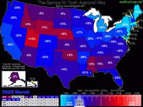
Thanks to Radical Russ for this lovely map of the Blue States, which reflects Bushie's vanishing approval ratings as of March, 2006.
Tennessee is blue!
The blogger has lots more, including a map that changes with Bushie's falling-in-the-toilet job approval scores.
Radical Russ explains:
Revel in the newest incarnation of the Bush Approval Map! This map displays the state-by-state job approval polls of Pretzeldunce Chimpy McFlightsuit. His Net Approval is his job approval minus his job disapproval ratings, with positive numbers representing states where more people approve than disapprove, and negative numbers representing the opposite.
I've color-coded the states according to their relative "Bush Love" in red to their relative "Bush Hate" in blue, with those states more toward the center shaded in purple. (I've made a change in the color scheme from the previous versions; I decided that the brighter reds and blues better visually demonstrated the figures. Plus the color shades change in 1% increments for more... uh... subtlety.)
The map begins at the 2004 Election, and every five seconds a new month appears.
Via Sandy at Hamdems
Bush Blue States Red States Job Approval Democrats Worst President Ever Bush Poll